Defining Neo-Retro Styles in Design

TL;DR
- This article covers the essence of neo-retro design, differentiating it from vintage and retro styles. It explores key elements like typography, color palettes, and visual imperfections; and how these elements are used in social media marketing and content creation to evoke nostalgia while appealing to modern audiences. You'll get practical insights on leveraging ai tools to create neo-retro content that resonates with your target demographic.
Understanding the Essence of Neo-Retro Design
Ever feel like you're stuck in a time warp, but like, in a good way? That's kinda what neo-retro design is all about. It's snatching inspo from the past but keeping things fresh and modern.
Neo-retro isn't just copy-pasting old styles. It's more like remixing them, taking vintage vibes and blending them with today's design principles. (Retro Design Trends: Why Vintage Aesthetics Still Dominate.) Think about it as if you are taking your grandma's furniture and giving it a modern upholstery.
It's about finding that sweet spot where nostalgia meets innovation (Americana Branding is Back and It's Everywhere), according to Hip and Authentic. Defining Neo-Retro Style in Package Design. This blend often shows up in brands using classic typography, like serif or script fonts, paired with clean, minimalist layouts and intuitive user interfaces. You'll also see it in packaging that combines tactile, textured materials with high-tech functionality, like QR codes or augmented reality integration.
So, what sets neo-retro apart from just plain "retro" or "vintage"? Well, vintage is the real deal – stuff that's actually old. Retro is imitating those styles, but it's new.
- Neo-retro, though? It's a modern spin; a reinterpretation, as Hip and Authentic. Defining Neo-Retro Style in Package Design puts it.
- The article also highlights that, neo-retro often uses contemporary tech and trends that might have grandma scratching her head. This could mean using augmented reality filters that give a vintage look, or incorporating interactive elements on a website that mimic old arcade games.
Understanding this difference is key to spotting neo-retro in the wild.
Key Elements of Neo-Retro Design in Content Creation
Alright, let's dive into the fun part, shall we? How do you actually make content that screams "neo-retro" without just slapping a filter on it? It's all about blending those vintage elements with a modern sensibility.
Think about fonts first. Using vintage-inspired fonts is a no brainer, but don’t be afraid to mix it up.
- evoke a specific era by combining something like a classic serif with a modern sans-serif. (Rules to combine Serif and Sans Serif fonts for my photography ...)
- Try mixing different typefaces for a handcrafted feel, almost like a poster from the early 20th century.
- Experiment with textures and effects, too. Letterpress or grunge effects can add a tactile dimension that digital fonts often lack. When these vintage-inspired textures are applied to a clean, modern layout, they create a striking neo-retro contrast, grounding the digital in a tangible, historical feel.
Color is another big one and you have to be careful. It's where you can really make something pop—or make it look like a hot mess, I'll be honest.
- Explore retro color schemes. Think pastels, muted tones, and then, BAM, a vibrant pop of color to catch the eye.
- Use color to create a specific mood. Muted greens and browns might evoke a '70s vibe, while brighter pinks and teals could channel the '80s.
- Don't be scared to balance vintage colors with modern gradients or accents.
Here's a quirky one: visual imperfections. It sounds counterintuitive, but hear me out. Adding textures like grain, noise, or even subtle scratches can really sell that authentic feel.
- Using hand-drawn elements to contrast with digital perfection can help in so many ways. For instance, a hand-drawn illustration of a product can add a personal, artisanal touch that stands out against a crisp, digitally rendered background, making the overall design feel more approachable and unique. It also helps to break up the uniformity of digital perfection, giving the content a more human and relatable quality.
- Try simulating printing errors or imperfections. A slight blur or a color bleed can make a design feel more like a vintage print and less like sterile, digital output.
It sounds like a lot, but the thing is that it’s that little extra something that makes it pop.
So, you've got the basics down. Now, how do you make sure this neo-retro style actually works for your content? That's what we'll tackle next.
Applying Neo-Retro Styles in Social Media Marketing
Now that we've covered the core elements of neo-retro design, let's talk about how to actually bring that vibe to life on social media. It's not just about slapping on a filter, you know. It's about making folks feel something real.
Think of each platform as its own little world. You gotta play to its strengths, right?
- Instagram: Go heavy on the visuals. Think vintage filters, but don't overdo it. Curate a feed that feels like a perfectly aged photo album. Healthcare brands could use old-school anatomical illustrations, perhaps with a muted color palette and a slightly distressed texture, to explain complex medical topics in an engaging, retro-inspired way, while still maintaining a modern, clean layout for readability.
- Facebook: Engage with nostalgia. Share vintage ads or images that resonate with your brand's story. Run contests that test people's knowledge of past eras. A retail company could post "guess the decade" quizzes featuring product imagery from different time periods, using vintage-style graphics and fonts for the quiz interface.
- Twitter/X: Snippets of retro gold. Craft tweets that reference iconic slogans or catchphrases. Use hashtags that tap into vintage trends. Finance firms could share bite-sized historical facts about market trends from the '60s, presented with a vintage-inspired typeface and perhaps a subtle grainy texture overlay on any accompanying images.
To help streamline the content creation process for these platforms, consider using AI-powered tools. For instance, you can use tools like social9 to:
- Generate engaging social media content with ai-powered tools.
- Create posts, captions, and hashtags that drive engagement.
- social9 offers ai-powered generation, smart captions, hashtag suggestions, content templates, and 24/7 support.
So, you've got a handle on how to bring neo-retro to social media. Now, let's talk about how to know if it's actually working.
Leveraging AI Tools for Neo-Retro Content Automation
Alright, so you wanna automate some neo-retro content? Ai can help with that, big time. But don't think you can just sit back and let the robots do everything, you know? It's more like giving your creative process a serious power-up.
You can use ai to whip up images in those specific retro styles, like Art Deco or Mid-Century Modern. It’s kinda wild how good it is!
Try customizing ai models to mimic vintage photography techniques. Think grainy textures or slightly faded colors, that sort of thing.
Don't forget to experiment with ai-generated patterns and textures. Like, imagine ai spitting out perfect 70s-style wallpaper patterns.
Use ai to generate captions that actually match the vibe of your neo-retro content. Nobody wants a boring, corporate-sounding caption on a groovy vintage-inspired post.
You can identify relevant hashtags that connect with your target audience. Ai can dig up those niche hashtags you’d never think of.
Optimize those captions for maximum engagement and reach. Ai can analyze what works and what doesn’t, tweaking things for the best results.
Creating reusable templates for neo-retro social media posts is a great way to keep things consistent. AI tools can assist by suggesting font pairings that evoke specific eras, generating color palettes inspired by vintage art movements, or even creating graphic elements like borders and icons that fit the neo-retro aesthetic. You can then customize these AI-generated template components with your specific brand messaging.
Also ensure consistency across all your social media channels.
So, next up, let's look at how to measure if all this neo-retro effort is actually paying off.
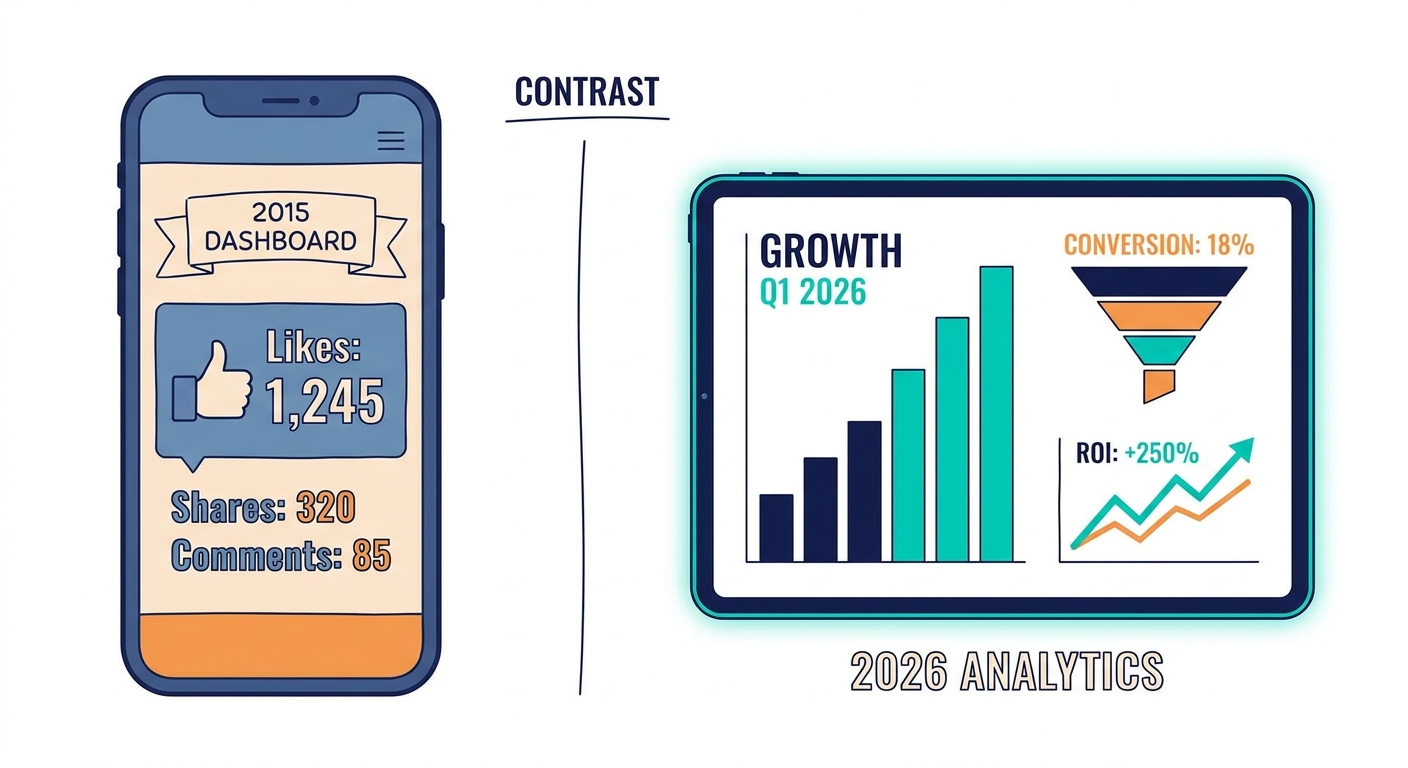
Measuring the Impact of Neo-Retro Design: ROI and Engagement
Alright, so you've been putting in that work with neo-retro content, huh? Time to see if it's actually paying off, beyond just lookin' cool. Now that we've explored how to apply neo-retro styles and leverage AI for content creation, it's crucial to understand the impact of these efforts.
- Track those likes, shares, and comments: Are they going up? 'Cause if not, Houston, we got a problem. Check if folks are diggin' that vintage vibe you're throwin' down.
- Click-through rates are your friend: Are people actually clickin' on those links and headin' to your site? If not, somethings up.
- Social media analytics: Get cozy with these tools. They'll tell you if your efforts are actually making a dent, or if you're just shoutin' into the void.
Basically, are people noticing? And more importantly, are they doing anything because of it? To truly understand the ROI, you need to connect these engagement metrics to business goals. For example, if your goal is to increase website traffic, a rise in click-through rates from neo-retro posts directly contributes to that. If you're aiming for lead generation, track how many of those clicks convert into sign-ups or inquiries. You can even calculate a rough ROI by comparing the cost of creating your neo-retro content (including any AI tool subscriptions) against the value generated by the conversions or increased brand awareness. For instance, if you spent $500 on AI tools and design time for a neo-retro campaign that resulted in 10 new leads, and each lead is worth $100 to your business, your generated value is $1000, giving you a $500 profit and a 100% ROI. Time to crunch those numbers, folks.